
...once again we get the inferior version of a proposal.
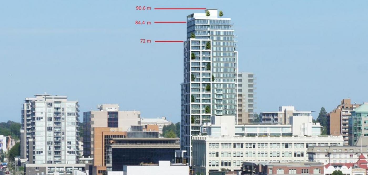
I hope that better images soon appear to convince me otherwise, but right now I'm seeing a tall slab wearing a prominent crest on an otherwise flat top. A decently sleek and distinctive design has reverted into something much more bulky and inelegant. The tapering of the highest levels is no longer evident.
Check images #2 and #3 above and tell me you don't see the family resemblance to the rental building at the left. The taller tower has the same basic & blocky form. But with a crest on top.
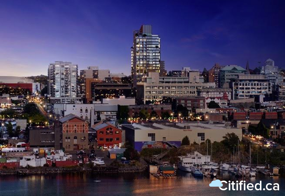
I'm really disappointed. That evening image from the west doesn't even look all that good, in all honesty. I'm supposed to be eager to see that building added to the skyline? Why? Because I have a fetish for more of the same but just a few stories taller? It really does look a lot like a taller version of the bland-but-acceptable rental tower but with a Mohawk hairdo. (Lest we forget, a Mohawk hairdo has never made something bland seem less bland.)
The middle image with it standing behind the Regent Hotel I don't mind so much. It looks fine (depending on the nature of that crest/shroud and the colour/materials), but it just doesn't look like anything particularly special. We've been waiting 12+ years for a rather ordinary condo building?
Folks, this thing should be one of the sharpest residential buildings in town. If it ends up being just more of the same then what relevance do height exemptions even have? Give me another Promontory if that's going to be the case. Or, give them the frickin' 29 stories if that's what it takes to roll back to the previous version.
Edit: see my revised impressions further down.
Edited by aastra, 12 October 2017 - 07:36 PM.