
...and the crane was dismantled at this site on Friday

[Downtown Victoria] 947 Fort | Mixed-use | 23.1m | 6-storeys | Built - completed in 2010
Started by
Scaper
, Oct 23 2006 01:18 AM
Office Commercial Condo
208 replies to this topic
#162

gumgum
-

- Member
- 7,069 posts
Posted 11 April 2010 - 05:41 PM
Thanks BCGuy. Your updates don't go unnoticed.
#163
yodsaker
-

- Member
- 1,280 posts
Posted 12 April 2010 - 10:37 AM
GITS, are you on a crane these days since P-side finished?
#164
D.L.
-

- Member
- 7,786 posts
Posted 05 July 2010 - 11:54 AM
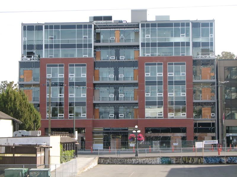
This building looks great!
Today
Fort Street side -

The smudge on the side of the building is from my camera.

Mears Street side -

Today
Fort Street side -
The smudge on the side of the building is from my camera.
Mears Street side -
#165
G-Man
-
- Moderator
-

- 13,805 posts
Senior Case Officer
Posted 05 July 2010 - 11:58 AM
Any word on tenants in this building?
#166
ryleyb
-

- Member
- 23 posts
Posted 05 July 2010 - 12:02 PM
In this type of situation, would the architect have been allowed to put windows on the sides of this building? Or is it given that the adjoining buildings will eventually be of similar height?
It just looks a little odd to me as is (4 stories of blank wall)....
It just looks a little odd to me as is (4 stories of blank wall)....
#167
Rob Randall
-

- Member
- 16,310 posts
Posted 05 July 2010 - 12:13 PM
No windows as it is a fire wall, up to the property line.
In an ideal world I would like to see a fifth or sixth floor set back a few inches with narrow glass block inserts. Square footage would be about the same but the blank wall would be broken up visually. If a tall building were built alongside the setback would form part of a light well. The Atrium has something similar.
Architects must conform to the fire code.
#168
D.L.
-
- Member
- 7,786 posts
Posted 05 July 2010 - 12:15 PM
At least there is an abstract design on the blank wall.
#169
Rob Randall
-
- Member
- 16,310 posts
Posted 05 July 2010 - 12:18 PM
I'm liking the proportions on this building.
#170
Baro
-

- Member
- 4,317 posts
Posted 05 July 2010 - 03:00 PM
Yeah it's a solid little design and the blank wall at least has some pattern.
Victoria has a blank wall problem, well a small one. We have many situations where there's a tall blank wall and a neighbouring lot that is much lower, and will stay lower practically for ever. When I see a blank wall, specially on an old building, it makes me a little sad as to me a blank wall is a promise of density and height to come. To see the back of the belmont building sitting there expecting neighbouring height that will never come and the countless other smaller situations of this type breaks my heart. We were really expecting wall to wall zero setback 4-8 story blocks all over downtown. In many cases we've missed the chance to ever bring up the height to match due to herritage, or now face impossible building codes and bylaws.
This is why I think a city needs MAXIMUM setbacks and minimum heights to achieve a more uniform street-wall, and after that you can set back and go nuts with height so long as you've got your street-wall section all lined up. Would love to see most of fort at this massing.
"beats greezy have baked donut-dough"
#171
LJ
-

- Member
- 12,736 posts
Posted 05 July 2010 - 07:16 PM
The utility pole in the middle of the building on the Fort street side sorta detracts both from the look of the building and the view out I would expect.
Life's a journey......so roll down the window and enjoy the breeze.
#172
VicHockeyFan
-

- Suspended User
- 52,121 posts
Posted 08 August 2010 - 09:27 AM
Office consolidation move touted as way to cut costs, hike efficiency
By Carla Wilson, Times Colonist August 8, 2010
Read more: http://www.timescolo...l#ixzz0w2JlokIP
<p><span style="font-size:12px;"><em><span style="color:rgb(40,40,40);font-family:helvetica, arial, sans-serif;">"I don’t need a middle person in my pizza slice transaction" <strong>- zoomer, April 17, 2018</strong></span></em></span>

#174
Baro
-
- Member
- 4,317 posts
Posted 29 August 2010 - 05:45 PM
Great elevation shot!
"beats greezy have baked donut-dough"
#175
jonny
-

- Member
- 9,211 posts
Posted 09 September 2010 - 01:06 PM
This is a great looking little building that is going to have a nice street presence on both Fort and Meares. What a contrast between this clean, handsome building and that off white monstrosity across the street. Not only does this building look great, but it's a nice size for the that side of Fort and interacts really well with the street level.
Hopefully the parking lot across Fort (next to the crack tower) and the derlict lot by View/Vancouver Sts. are developed sooner rather than later.
Hopefully the parking lot across Fort (next to the crack tower) and the derlict lot by View/Vancouver Sts. are developed sooner rather than later.
#176
aastra
-

- Member
- 20,742 posts
Posted 09 September 2010 - 04:00 PM
It does look really good. Better than I was expecting. Better than the rendering.*
Fort Street could be a great street from end to end so easily. Just put some more lowrise office and residential on the empty lot at Fort & Quadra and just put some decent density on the parking lot between Fort & View along with an attractive and safe mid-block walkway that could actually be useful and appealing to people.
Oh, wait, somebody has already proposed just that sort of thing for the parking lot and the city has been giving them grief for it.
*Yet another example of a rendering that turned out to be inferior to the actual building. The popular misconception is that buildings don't usually live up to the renderings/models.
#177
G-Man
-
- Moderator
-
- 13,805 posts
Senior Case Officer
Posted 09 September 2010 - 07:32 PM
I would say that the ground level is not as good as the rendering at this point. But I am hoping it gets better. There is a lot of stuff between the pedestrian and the windows. A more angled shot would reveal this better.
#178
aastra
-
- Member
- 20,742 posts
Posted 09 September 2010 - 08:24 PM
These images from de Hoog & Kierulf's website seem to most closely resemble the actual building, yes? (as compared to the images earlier in this thread)

picture from http://www.dhk.ca/
picture from http://www.dhk.ca/
#179
Rob Randall
-
- Member
- 16,310 posts
Posted 09 September 2010 - 08:35 PM
What's remarkable is the fact that the building went through three architectural firms: Jan Zak, Karen Hillel and DeH & Kierulf. Remember the wavy hood ornament that was planned for the centre?
Also, the change from residential to office. Yet through all this the building looks cohesive.
Zak has a good track record which is why I have faith in his Jukebox design.
Also, the change from residential to office. Yet through all this the building looks cohesive.
Zak has a good track record which is why I have faith in his Jukebox design.
#180
G-Man
-
- Moderator
-
- 13,805 posts
Senior Case Officer
Posted 10 September 2010 - 06:06 AM
Thanks Aastra the rendering on the left clearly shows the issue I have with it with those big chunky brick parts intruding into the public space.
You're not quite at the end of this discussion topic!
Use the page links at the lower-left to go to the next page to read additional posts.
Use the page links at the lower-left to go to the next page to read additional posts.


0 user(s) are reading this topic
0 members, 0 guests, 0 anonymous users

