+++
This letter was published in the October 2006 number of Victoria's FOCUS magazine in a slightly edited version under the headline 'Di Castri's flawed church design,' on pages 7 and 8. Here is the original unedited letter as submitted to the editor.
+++
Brian Grison's enthusiasm for John Di Castri's design of the interior of Saint Patrick's Church is misplaced. For Mr. Grison, it is 'perhaps the most powerful architectural manifestation of Di Castri's philosophy.'
As a working Catholic artist who regularly worships there (for convenience sake, not for aesthetic reasons), I have thought long and hard about why the St. Pat's interior fails. The main problem as I see it is one of insufficient lighting, which is unrelieved by the 42 huge slabs of polished black stone which were used on the two side walls.
These rectangular stone panels are arranged in groups of three, seven to a side, making 14 grounds for the Stations of the Cross. If the late great Catholic architect John Di Castri is responsible for the crude modernist drawings which have been etched and painted with gold leaf on this stone, it is certainly no credit to his memory.
Some light is allowed to enter the sacred space, but it is diffused through opaque white glass arranged in narrow vertical rectangles in between the stone slabs, but is so inadequate it had to be enhanced by hidden fluorescent lighting arranged on top of the Stations.
Similarly, when one looks up to the apex, 'the central peak of the exposed wooden roof supports,' as Mr. Grison puts it, we find more opaque glass to let in some light through the roof, but not enough, so it too has been augmented by four long rows of ugly exposed fluorescent light bulbs running on both sides of the whole length of the centre span.
Perhaps all this gloominess explains how Mr. Grison could suggest that 'there is something reminiscent of "Man-against-Nature" or Nietzcheian angst to the church interior.' If Mr. Di Castri did, as Mr. Grison suggests, build a temple of angst which alienates worshippers from Nature, rather than focusing their attention on the Crucifix which should dominate the viewer's gaze upon entering, I can only conclude that he failed, if his intention was to build a Catholic church where Christ's triumph over Death is celebrated daily.
+++

Why John Di Castri's Saint Patrick's interior fails
Started by
Gregory Hartnell
, Nov 08 2006 08:16 PM
3 replies to this topic
#2

Holden West
-

- Member
- 9,058 posts
Va va voom!
Posted 25 November 2006 - 12:21 AM
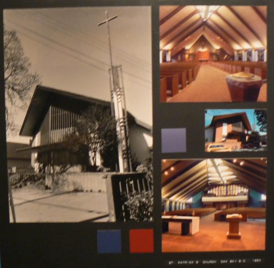
I apologize for this poor photo. It's one of the 1980s exhibition panels that form part of the recent DiCastri show at the Maltwood.
Church architecture interests me and I intent to visit this church to see for myself.
What I've noticed about a lot of DiCastri's architecture from this era is that the windows tend to be long slits--not big expanses, whether commercial or residential. Is it gloomy? I don't know yet, but what looks gloomy to one person might be dramatic to another. It's definitely a product of it's time. I think DiCastri was trying to use lighting to capture the feeling of the dark Gothic cathedrals of the past.
Contrast St. Patricks with the sun-drenched expanse of the Glad Tidings Church on Quadra which dates to the late 70s, I think. QT Movie. Different religion, different church, completely different atmosphere.
"Beaver, ahoy!""The bridge is like a magnet, attracting both pedestrians and over 30,000 vehicles daily who enjoy the views of Victoria's harbour. The skyline may change, but "Big Blue" as some call it, will always be there."
-City of Victoria website, 2009
-City of Victoria website, 2009
#3
FunkyMunky
-

- Member
- 416 posts
Posted 25 November 2006 - 01:36 AM
If you have the chance, check out the [url=http://www.mccallbros.com/:534f4]McCall Bros[/url:534f4] funeral home at 1400 Vancouver Street (at Johnson Street). Its a wonderfully intimate chapel that features angled planes (15 degrees if I remember correctly what Mr DiCastri said). Even though its a modernist building, you can clearly see the horizontality of the prairie school (He studied with Frank Lloyd Wright and Bruce Goff).What I've noticed about a lot of DiCastri's architecture from this era is that the windows tend to be long slits--not big expanses, whether commercial or residential.

#4
Baro
-

- Member
- 4,317 posts
Posted 25 November 2006 - 01:39 AM
Architecture of this time often goes for form over function, and totally misses the human factor. Interesting and wierd shapes, thin geometric lines. It's nice to look at, but when you have to actually use these types of buildings, they often come off as gloomy, badly laid out, and in many cases cheap feeling.
"beats greezy have baked donut-dough"


0 user(s) are reading this topic
0 members, 0 guests, 0 anonymous users

