One that has no bike lane.
But a sidewalk wide enough for scooters!
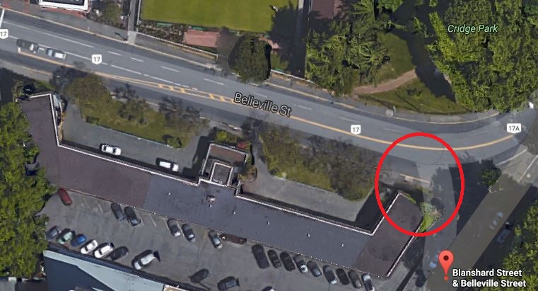
 | BUILT Tapestry at Victoria Harbour Uses: rental, commercial Address: 701 Belleville Street Municipality: Victoria Region: Downtown Victoria Storeys: 15 |

Posted 15 November 2016 - 09:25 AM
One that has no bike lane.
But a sidewalk wide enough for scooters!

Posted 15 November 2016 - 09:30 AM
But a sidewalk wide enough for scooters!
3 scooters side by side so they can race!

Posted 15 November 2016 - 09:42 AM
The lowrise section is looking much better than before. There's actually a decent amount of variation all over it now. It's a good proposal, but it just doesn't seem to be equal to the location. What happened to the orange on the previous version of the tower? Methinks a splash of a different material or colour would make a big difference. How about some distinguishing of the 2nd & 3rd floor corner on the lowrise section (like glassing over the entire corner or something)? And the top of the tower demonstrates that "head chopped off by a height restriction laser" effect, as so many modern buildings in Victoria do. An additional level on top with a distinctive shape (oval or checkmark or etc.) might be good.

Posted 15 November 2016 - 09:51 AM
IMHO, rounding off the NE corner of the tower, to better reflect the curve in the road, would help this aesthetic a lot.
Posted 15 November 2016 - 09:59 AM
I don't agree, because that section actually looks pretty good. I like the differentiation between the lower 3/4 and the upper 1/4, and the way the windows are merged in the lower part to suggest double-height levels.
Putting a Juliet-esque curved corner on the tower units facing the bowling green might work, but methinks such a change would be out of the question at this point.
Edited by aastra, 15 November 2016 - 10:02 AM.
AllSeeingEye

Posted 15 November 2016 - 10:18 AM
While I agree the current design is bland to the max, there were at least 2 previous proposals that were superior in every way (aesthetically speaking) and some group or other managed to get them shot down.
What is the JBNA's definition of a "signature" design anyway?
Anything, no matter how fugly the actual design, as long as its 4 stories or less......
Posted 15 November 2016 - 10:30 AM
...Putting a Juliet-esque curved corner on the tower units facing the bowling green might work, but methinks such a change would be out of the question at this point.
Of course it would be. There was a chance for an outstanding design at this location, but that time has long past. Thank you NIMBYs!
Posted 15 November 2016 - 11:33 AM
I'm surprised we aren't talking a lot about this one. Major building, prominent location... where is everybody? Is Mike K. AWOL or something?
You know, if they were to keep it exactly as shown in the illustration above but just clad part of it in some really nice marble or terra cotta or some other material/colour/texture that we don't already have in spades on modern buildings, that just might be enough to win me over for keeps. Just something striking to set it apart and add another touch of architectural interest in south downtown. They wouldn't have to break the bank. Just a small section* or some repeating detail. Even some glue-lam beams/pillars might do it. I'm talking about adding a dash of spice to the dish.
*If the face of that 4-story section that connects the tower to the lowrise wing is just painted concrete then I nominate that face for dressing up.
Love the colour of the terra cotta on this place (scroll down to really see it):
http://fieldconditio...14/11/4/10-bond
Edited by aastra, 15 November 2016 - 12:07 PM.
Posted 15 November 2016 - 11:42 AM
I think I'd be more accepting of this proposal if I had never been exposed the earlier concepts for this site. The design in itself isn't bad, just rather "meh". I agree that some outstanding finishing materials would go a long way to win me over.

Posted 15 November 2016 - 11:56 AM
Posted 15 November 2016 - 11:58 AM
Give me a few splashes of some distinctive material or colour (Anything! Except red brick!) and distinguish the top floor a bit more and I think I would be able to live with it.

Posted 15 November 2016 - 12:01 PM
The only design that could be called "signature" might be the Westbank plans that included a dramatic corner treatment where a new Art Gallery would go.
Which I thought was spectacular ...
Posted 15 November 2016 - 12:01 PM
The upper floors of the tower facing St. Ann's is probably the weakest section.
Posted 15 November 2016 - 12:08 PM
The upper floors of the tower facing St. Ann's is probably the weakest section.
I wish there was more articulation of the long facade on the Belleville side. The proposed variation in finishing materials will help mitigate this to some extent, but overall it seems too flat across the entire front.
Posted 15 November 2016 - 12:32 PM
I think it looks just like several of the recent new buildings !!! I want to see more modern looking, more glass ... a tower at both ends ... and please, not 15 floors !!!
Posted 15 November 2016 - 12:40 PM
As a general guideline I think every large new building should be obligated to give the man on the street a damn good reason to take a photograph. Always ask, "Why would somebody bother to snap a pic of this place?" There has to be something -- anything -- that sets it apart and makes it interesting.
I'd say this question is very easy to answer for Aria, Shoal Point, 800 Yates, the Falls, Corazon, the Reef, the Juliet, Shutters, the Fannin tower, the Railyards, Parc Residences, Era, Balance at Dockside Green, the Janion, the Oak Bay Beach Hotel, the curving building at Sayward Hill, etc.
Posted 15 November 2016 - 12:42 PM
...and please, not 15 floors !!!
Building taller than 15 floors* in downtown Victoria apparently would usher in the Armageddon. I guess we'll know for sure if the tallest of the Hudson Place towers actually gets built to its approved height.
* I know both Legato and 989 Johnson will be taller, but not by much.

Posted 15 November 2016 - 08:08 PM
As a general guideline I think every large new building should be obligated to give the man on the street a damn good reason to take a photograph. Always ask, "Why would somebody bother to snap a pic of this place?" There has to be something -- anything -- that sets it apart and makes it interesting.
I'd say this question is very easy to answer for Aria, Shoal Point, 800 Yates, the Falls, Corazon, the Reef, the Juliet, Shutters, the Fannin tower, the Railyards, Parc Residences, Era, Balance at Dockside Green, the Janion, the Oak Bay Beach Hotel, the curving building at Sayward Hill, etc.
funny I've been saying that for years too. Doesn't take much, but do something with your damn building to make me appreciate it even a little. You know, stop, notice that detail, and actually enjoy walking by or sitting outside of it. Who wouldn't want a city that makes you feel good vs. bland grey streets. So easy.. I feel a new thread coming on.
Posted 15 November 2016 - 08:16 PM
I always remember a couple of real gem's of a comment from someone on city council ... "people don't go to cities to look at buildings" and "that building will block my view while I'm driving around" ...
Posted 18 November 2016 - 10:34 AM
A stunning revelation from last night's council discussion regarding this proposal
A Concert Properties proposal to build a 15-storey seniors tower on the Belleville Street site of the former Crystal Court Motel will go to public hearing. Through almost three hours of debate Thursday that ranged from neighbourhood traffic patterns and building height to the potential provision of affordable housing, it became clear not all councillors were entirely satisfied with the proposal...
- See more at: http://www.timescolo...h.6q8zd67T.dpuf
Surely "building height" couldn't have been a bone of contention could it? In Victoria? How unusual. 


0 members, 1 guests, 0 anonymous users

Community Forum Software by IP.Board 3.4.6
Licensed to: Citified Media Inc. All materials © Copyright Citified Media Inc. All rights reserved.
