Jump to content


Photo

[Downtown Victoria] Centro condos | 54.4m | 19- & 14-storeys | Canceled


  • Please log in to reply
203 replies to this topic

#21 Nparker

Nparker
  • Member
  • 40,672 posts

Posted 18 October 2007 - 04:06 PM

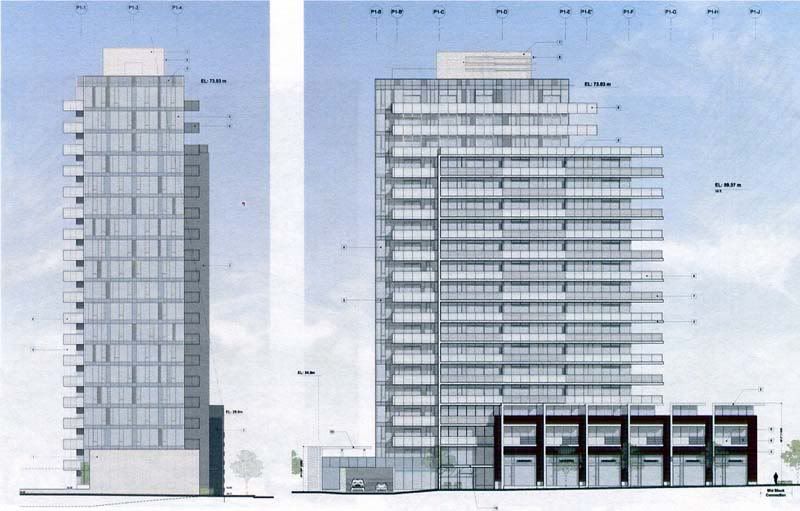
I think townhouses would be better than dead store fronts. Owners are more willing to call the police and stand up for their property.


I agree, I can't see this as a lively retail area. And store fronts are dead when their "security eyes" are needed most - later in the evening and overnight. Nicely designed ground floor townhouses would work well here and compliment the established pattern at the Corazon.

#22 Caramia

Caramia
  • Member
  • 3,835 posts

Posted 20 October 2007 - 10:46 AM

I agree - I think that residential with street access/ownership is exactly what that street needs. Also, the social problems shift around the city - they cluster where things are not lively. Retail is only alive during business hours - not enough to tip an area - so then you just end up with pissed of business men who think it is their right to have a profit, regardless of where they situate, and unsympathetic street people, who feel that it is their territory. Better to have people living there - there is no argument about whose space it is then.
Nowadays most people die of a sort of creeping common sense, and discover when it is too late that the only things one never regrets are one's mistakes.
Oscar Wilde (1854 - 1900), The Picture of Dorian Gray, 1891

#23 Rob Randall

Rob Randall
  • Member
  • 16,310 posts

Posted 25 October 2007 - 05:03 PM

Talking with a few Cormorant Street residents yesterday, most felt we should not allow transitory social issues determine how we build our city and that townhouses are a good thing for Cormorant Street.

#24 Baro

Baro
  • Member
  • 4,317 posts

Posted 25 October 2007 - 05:54 PM

Townhouses good, pointless open spaces bad!
"beats greezy have baked donut-dough"

#25 Nparker

Nparker
  • Member
  • 40,672 posts

Posted 03 November 2007 - 09:56 AM

Any updates on this proposal? Or since it is Townline are all bets off?

#26 Mike K.

Mike K.
  • Administrator
  • 83,469 posts

Posted 04 November 2007 - 06:07 PM

So word has it that one of the towers has been raised to 19-storeys from 14 and I believe that they may have already approached planners with the revised height.

Know it all.
Citified.ca is Victoria's most comprehensive research resource for new-build homes and commercial spaces.


#27 aastra

aastra
  • Member
  • 20,741 posts

Posted 05 November 2007 - 10:33 AM

Height, schmeight! What does it LOOK like???

#28 Rob Randall

Rob Randall
  • Member
  • 16,310 posts

Posted 06 November 2007 - 08:12 PM

This is the revised version with the 19-storey Pandora tower:


#29 Mike K.

Mike K.
  • Administrator
  • 83,469 posts

Posted 06 November 2007 - 08:36 PM

Thanks for posting the renderings.

Which of the two towers is planned as phase I?

I would be in favour of an interesting roof element atop the tallest tower. This is a signature downtown location, and, as per a discussion we had a while back about Victoria's boring "roofline" and the need to design attractive crowns on buildings, it must reflect that in its entire design. I want to see an attractive crown or spire here!

#30 Holden West

Holden West

    Va va voom!

  • Member
  • 9,058 posts

Posted 06 November 2007 - 09:16 PM

It doesn't look like a signature building; more like "filler".

I assume the short tower is phase I.

#31 zoomer

zoomer
  • Member
  • 2,144 posts
  • LocationVictoria - Downtown

Posted 06 November 2007 - 09:23 PM

I would love it if those rough massing models ended up being very close to the actual design! Sweet! Especially the watercolour, those protruding wrap around (on the smaller tower) glass balconies look awesome. Hopefully they really do turn out to be all glass, and a darker blue glass would add some much needed variety and lightness to the downtown as well. The boxy, geometric design with extruding edges makes it look like an interesting glass puzzle. This is a style I actually wouldn't want a spire on. Of course I may be reading way too much into these renderings.

Now I'm really excited about this project!

#32 Ms. B. Havin

Ms. B. Havin
  • Member
  • 5,052 posts

Posted 06 November 2007 - 09:30 PM

I don't like this one at all. For something that visible to be so bland (but simultaneously in-your-face) is nearly painful. It's like a View Towers in glass. I make that comparison also b/c this thing will stand in isolation for eons (just as VT has done -- something that only now might -- and remember: MIGHT -- change), since nothing else close by stands to be developed, aside from closer to City Hall, where the bell tower height restriction will force new buildings to be significantly shorter than the 19-storey Centro Tower. So this one will really stick out from the landscape, and right now it looks like something you could buy at Walmarts. Assembly-line landfill (er, I mean infill) material...

#33 zoomer

zoomer
  • Member
  • 2,144 posts
  • LocationVictoria - Downtown

Posted 06 November 2007 - 10:57 PM

Simple, doesn't always mean bland, although I can see where you're coming from Ms. B.

Yes, I admit, there is at least a 50/50 chance these will be bland and tedious, but hopefully if the right materials are used, the balconies are continuous, and they emphasize the geometric simplicity and interaction of cube shapes, it could be cool.

However, as Ms. B seems to be suggesting it could turn out as awful as this:

22 Wellesley in Toronto (when nearly completed construction)


I suppose I'm hoping (the smaller one is my favourite) it could turn out something like Richard Meier's Miami Beach House:


The use of different colour glass panels could be nice too:


#34 Galvanized

Galvanized
  • Member
  • 1,196 posts

Posted 06 November 2007 - 11:56 PM

I'm not a fan of the glass wall facing Douglas plus I think it's too tall for that spot (ala standing out like View Towers as Ms B said). The other building looks like it may have potential. I'd like to see more Corazon's on this block instead.

#35 G-Man

G-Man

    Senior Case Officer

  • Moderator
  • 13,805 posts

Posted 07 November 2007 - 07:47 AM

I wanted to hate this project but as Zoomer said this is different enough that I actually like it. I agree it would be nice to see some sort of conclusion to the building at the top. This will not be in isolation Gateway green is a 50 m north and the Juliet is 50 m south.

And it most definitely won't be like View Towers, I mean View towers in glass is not View Towers. And the isolation of VT is far more significant I think that if the Hudson Gateway Green Radiius and the Juliet were there this would seem so different.

I still have major concerns about how they treat Pandora and Cormorant but those is the details.

#36 aastra

aastra
  • Member
  • 20,741 posts

Posted 07 November 2007 - 12:55 PM

The slim side is very slim, which is good. But the design is very ordinary and I don't see how the developer can justify the extra height.

#37 G-Man

G-Man

    Senior Case Officer

  • Moderator
  • 13,805 posts

Posted 07 November 2007 - 12:59 PM

I don't think they need to justify height they just need to improve the design at 19 storeys.

#38 aastra

aastra
  • Member
  • 20,741 posts

Posted 07 November 2007 - 01:37 PM

Or leave it basically the same but make it only 12 or 14 stories.

#39 G-Man

G-Man

    Senior Case Officer

  • Moderator
  • 13,805 posts

Posted 07 November 2007 - 04:31 PM

Why would a design be bad at 19 storeys and be good at 14 storeys. I think they should try and improve at what ever height they are planning.

#40 aastra

aastra
  • Member
  • 20,741 posts

Posted 07 November 2007 - 04:49 PM

Methinks the main reason the highrise form strikes some people as unattractive is because of the excessive repetition. City Place is a nice building but it wouldn't be as nice if it was exactly the same but three times as tall. I really like the Reef and I think it could have used one or two more stories on it. But not 15 or 20. The nice side of Parc Residences works well as it is, but if you Photoshop it into something twice as tall, it looks hulking and rather ugly.

Unless some effort is made to distinguish podium from lower floors from higher floors from penthouse/roof, the additional floors can indeed detract from the building's overall appearance.

In the case of Centro, it seems to me that they've designed a 10- or 12-story building and then turned it into a 19-story building simply by piling on additional floors. You've got to make it look like there's a reason you made it that particular height. Otherwise the height will seem arbitrary and (if it's very tall) excessive.

It can be something as simple as the diagonal line that ascends the face of Bentall 5. Remove that detail and you've got a rather plain, "cookie-cutter" highrise.


You're not quite at the end of this discussion topic!

Use the page links at the lower-left to go to the next page to read additional posts.


0 user(s) are reading this topic

0 members, 0 guests, 0 anonymous users