Jump to content


UNDER CONSTRUCTION
Spencer Block
Uses: rental, commercial
Address: 611-635 Chatham Street / 610-618 Herald Street
Municipality: Victoria
Region: Downtown Victoria
Storeys: 5
Spencer Block is comprised of two rental buildings between the 600-blocks of Chatham and Herald streets at Gov... (view full profile)
Learn more about Spencer Block on Citified.ca
Photo

[Downtown] Spencer Block | Rentals; commercial | 5 & 5-storeys


  • Please log in to reply
107 replies to this topic

#21 Jackerbie

Jackerbie
  • Member
  • 3,776 posts
  • LocationRichmond, BC

Posted 02 October 2020 - 10:56 AM

It's unobtrusive and fits the context well. It's nice to see that the ground floor has been designed with big windows and awnings, which is in keeping with the "historic" look of a brick building. It is however very repetitive, despite their attempts to break up the massing and add small details at the cornices and awnings.


Capture.PNG


Lots of interesting details in the drawings, I won't reproduce them all here. Murals proposed at the Chatham and Government corner as an interim condition, different material palette on the Chatham building with a more industrial feel, co-working space on the Herald Street frontage...


I certainly like it more than CityZen across the street.


  • aastra and newbie_01 like this

#22 Brantastic

Brantastic
  • Member
  • 924 posts

Posted 02 October 2020 - 11:11 AM

I agree with everything you said Jackerbie. 

Maybe it would feel less repetitive if one of the balcony sections (preferably the second to the right in the image above) were removed to make one of the frontages wider than the others to give it a bit of variation (so 4 individual facades with one larger than the others instead of 5 facades of nearly identical size). Maybe with different materials or colours for the larger section. Or even just one or two storeys of height variation here and there. I appreciate the attempt to provide a sense of granularity, but if each "grain" is nearly identical to each adjacent grain, it starts to feel like one big grain, and no longer feels truly granular. I hope I'm making some sort of sense. 


  • zoomer and aastra like this

#23 Nparker

Nparker
  • Member
  • 40,221 posts

Posted 02 October 2020 - 11:20 AM

They are on the right track, but it definitely needs more variation across the facades.

#24 G-Man

G-Man

    Senior Case Officer

  • Moderator
  • 13,786 posts

Posted 03 October 2020 - 09:09 AM

Wow I thought that second rendering was a joke photoshop of the first one posted. Surely they could vary the heights by making part of it concrete and taller and then another point lower. This is just a little too much.

Visit my blog at: https://www.sidewalkingvictoria.com 


It has a whole new look!


#25 aastra

aastra
  • Member
  • 20,568 posts

Posted 13 October 2020 - 08:06 AM

More than a little too much. Come on, what year is this? That's a longscraper. It's crazy that this stuff is still happening. And you've got to vary the heights or at least employ some visual tricks to suggest inconsistent rooflines. The old town is NOT about uniform heights.


Take any one or even any two of the sections and I'm a big fan. But it's just way too much of the same.


#26 aastra

aastra
  • Member
  • 20,568 posts

Posted 13 October 2020 - 08:08 AM

The corner section all by itself looks terrific. The overall esthetic is right on, it's just way too much of the same thing.


In that long view above, add 3-4 stories on top of the far-right sections and totally change up their appearance.


Edited by aastra, 13 October 2020 - 08:13 AM.


#27 aastra

aastra
  • Member
  • 20,568 posts

Posted 13 October 2020 - 08:23 AM

And now I'm realizing there's just one look along Chatham as well (different look, but just the same long thing). Come on, proposing a repetitive longscraper should get you laughed out of the room well ahead of the guy who proposes a skyscraper.


What's with the lack of colour all around? Please tell me the CoV isn't encouraging that now.


  • Nparker and Brantastic like this

#28 Rob Randall

Rob Randall
  • Member
  • 16,310 posts

Posted 13 October 2020 - 08:28 AM

It really is just one big building and the challenge is to relieve the monotony without it looking too self-conscious. You want to avoid that arbitrary fake-looking, glued-on facade look. 


I would like to see the lot divided and given to two competing architectural firms. The buildings would have to be co-ordinated but each half would have its own unique vision.


  • Brantastic likes this

#29 Vin

Vin
  • Member
  • 134 posts

Posted 13 October 2020 - 12:31 PM

Love it! Reminds me of City of London terraced flats in so many of its neighbourhoods. 


https://www.google.c...!7i16384!8i8192


Edited by Vin, 13 October 2020 - 12:31 PM.


#30 baconnbits

baconnbits
  • Member
  • 235 posts

Posted 14 October 2020 - 11:46 AM

Love it! Reminds me of City of London terraced flats in so many of its neighbourhoods. 


https://www.google.c...!7i16384!8i8192

I think it looks great. could it be improved? yes and im' sure as they progress that will happen with feedbaack from citizens and council.

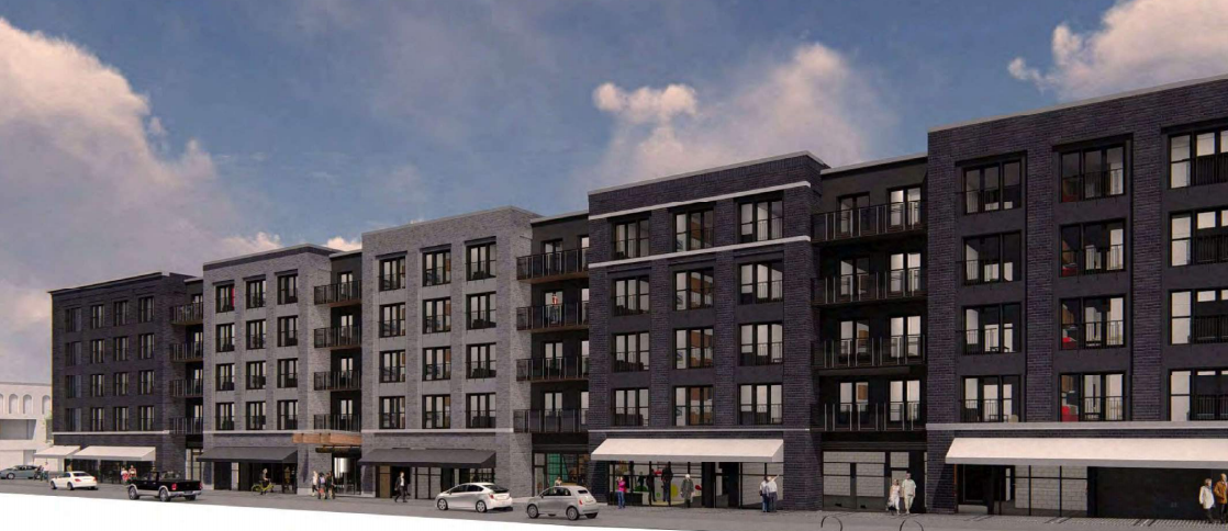
it's a "long scraper" because height restrictions wont permit a tall tower and its more economical to build 250 units at once than in stages and if you can't build them up, you have to build them across

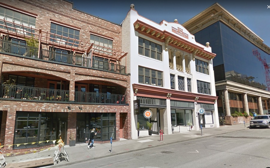
buildings like this get built all over the world. i dont understand the aversion? it adds diversity to the streets versus all towers.  yous see buildings like this throughout a lot of great cities.

they are trying to build htis because it is made of wood which is cheaper than concrete. that means they dont need as high rents as a concrete building requires.   if the city truly wants to see new affordable rental product, not just high end concrete towers asking $2k a month for all units, they should enable more of this type of construction throughout the city.


if they varied the heights a) they would lose units making the deal less economical, b) their cost would increase cause the development is less uniform and c) because of a and b they'd have to pay less for the land to make the deal work and the sellers probably don't sell which means no units happen


don't let perfect be the enemy of the good. vary it up with some sky scrapers where appropriate but be willing to enable larger wood deals that only rise 6 floors up.  the buidling will be nicely squeezed between numerous older buildings that will break it up.


great proposal!


  • Vin likes this

#31 aastra

aastra
  • Member
  • 20,568 posts

Posted 14 October 2020 - 01:25 PM

buildings like this get built all over the world. i dont understand the aversion?


That's the aversion. Long lowrise blocks are standard-issue, they can be super repetitive and bleak, they're the opposite of organic urban granularity, they overwhelm with over-planned uniformity where we naturally expect (& desire) complexity & variation, etc.


We all understand why the developers propose longscrapers. The mystery is why the city compels them to do it. Once again we have a contradiction. If all of the city's development rules and restrictions are really about preserving Victoria's uniqueness, then why enforce the same uniform & repetitive longscrapers that every city and every suburban municipality everywhere is building like crazy? Even Langford is building lowrise longscrapers. For those of us who've been suffering through the critiques about "cookie-cutter" architecture for our entire lives, it's especially frustrating and ridiculous. Repetitive longscrapers are the definition of cookie-cutter.


#32 aastra

aastra
  • Member
  • 20,568 posts

Posted 14 October 2020 - 01:26 PM

Like I say, the esthetic on either street is actually pretty good. But it's just getting copied and pasted way too many times.


#33 aastra

aastra
  • Member
  • 20,568 posts

Posted 14 October 2020 - 01:47 PM

It's funny because that block of Herald Street already has some good examples of how to do it and how not to do it. In the pic below we're seeing some decent granularity, with two modern buildings book-ending an older building. The long apartment building across the street is a bad fit by comparison. When you're walking along you don't want to see the same thing for a long stretch. Okay, so you employ tricks to create the illusion of multiple smaller buildings. Again, I have no problem with that. But how far can you go with it? If half a block is doable then why not a full block? And why are we pushing the envelope in this regard to begin with? It has nothing to do with the established built form of the old district, and it can go foul very easily.


Herald_Street_Granularity.jpg


Edited by aastra, 14 October 2020 - 01:48 PM.


#34 aastra

aastra
  • Member
  • 20,568 posts

Posted 14 October 2020 - 01:52 PM

^Notice the variation in the heights of the ground floors along the slope. First a very tall ground floor on the modern office block, then a shorter but still tall commercial ground floor on the old building, then a much shorter ground floor on the modern residential building. Now compare to this:


post-3717-0-46814500-1601664648.png


Edited by aastra, 14 October 2020 - 01:55 PM.


#35 aastra

aastra
  • Member
  • 20,568 posts

Posted 14 October 2020 - 02:05 PM

Everything lines up, laser straight. The ground levels, the windows on every residential level above, and the rooflines along the top. There's a bit of visual discontinuity along the way, which is good, but even the interruptions and style changes are predictable and seem to occur at regular intervals. There's none of that natural variation that we would expect to see if these were actually two or three separate buildings.


Lest we forget, the long retirement complex proposal on Fort Street had all of these same issues to contend with.


#36 aastra

aastra
  • Member
  • 20,568 posts

Posted 14 October 2020 - 02:13 PM

It's hard to tell, are they doing much to distinguish the balconies and railings with each section? That could be an easy way to give some unexpected personality here or there.


I think those long awnings in the rendering are not helping. You want to break up the regularity and repetition, not emphasize it.


#37 aastra

aastra
  • Member
  • 20,568 posts

Posted 14 October 2020 - 02:34 PM

Even if the heights of the ground floors don't vary, the styling of the ground floors should range widely. Different windows, different doors, different trim, etc. So when you're walking by you might actually think you were seeing unique buildings in an authentic urban environment, rather than generic storefronts in a strip mall or some singular large complex.


Not for every section, but maybe three variations on the Herald St. side and two variations on the Chatham side.


Edited by aastra, 14 October 2020 - 02:35 PM.

  • Nparker likes this

#38 Rob Randall

Rob Randall
  • Member
  • 16,310 posts

Posted 14 October 2020 - 02:43 PM

But then you begin to tread dangerously into fake Disney/Eaton Centre territory where you have a long concrete block with arbitrary facades glued on to give it the illusion that it's a streetscape built up over time. There's something disingenuous about it. 


It's an unavoidable problem when a developer acquires an entire block. The only way out as I said is to split it up and give it to two architects. Then at least the differences are genuine different visions.


Unless you think Eaton Centre is a grand success.


#39 aastra

aastra
  • Member
  • 20,568 posts

Posted 14 October 2020 - 02:55 PM

Any way you dress it it's still one singular large complex underneath. But if the battle is already lost because the CoV doesn't give a damn then I say spend a few bucks to dress it as best you can. Some of the storefronts on the Eaton's centre are pretty decent.


And the stylings don't have to be faux-heritage in nature. Why couldn't one of the sections have a perfectly modern facade?


Heck, why not townhouses along the ground somewhere? Just for the sake of variation?


#40 Rob Randall

Rob Randall
  • Member
  • 16,310 posts

Posted 14 October 2020 - 03:03 PM

Yes. To make it authentic, start from the retail ground floor. Establish the width--some storefronts may be wider than others. Maybe make the narrowest storefront have a double-height ceiling. Other ground floor spaces are parking and resident entrances etc.


Now that you have established your ground floor, extrapolate upwards. Now each section has its own authentic character. And avoid flatness--have the sills stick out, the windows recessed, give it some depth.


You're not quite at the end of this discussion topic!

Use the page links at the lower-left to go to the next page to read additional posts.


1 user(s) are reading this topic

0 members, 1 guests, 0 anonymous users