Did we talk about this Focus article from September?
I'm really disappointed with the left section. The left section looks about as out-of-place as it could possibly be in the old town:
- the ground floor is short (unlike other old town buildings);
- the windows and lines are horizontal rather than vertical (unlike other old town buildings);
- there seems to be nothing in the way of distinctive detail or ornamentation, and just a lot of blah brick (unlike other old town buildings)
If our spotlight is really going to be on heritage considerations as per the article, then I'd rate the above issues to be hardly any less important than the facadism aspect.
The Johnson St. side looks pretty good, although I'm not thrilled about those plain brick pillars along the ground. The mindset should be all about distinctive details and individualizing the old town's modern architecture, as versus obliging modern stuff to be mundane and conventional. The faux modern wing of the hotel is kitty-corner across the intersection. I don't have a problem with two modern buildings facing each other (it wouldn't be a first for Victoria's old town), but I'm sure not thrilled with the prospect of two modern buildings facing each other and also flaunting such a similarly conventional faux vibe. People expect the old town to be charming, quaint, etc. Anything but conventional.
When I see the great work that's happening in the old districts in Hamilton and other cities I just feel like Victoria is dropping the ball. It's a special thing to have a legitimate old town area. So treat it like it's special, for crying out loud. If facadism is such a concern then here's an idea: give us some striking new architecture as part of the deal, so that we can feel better about it.
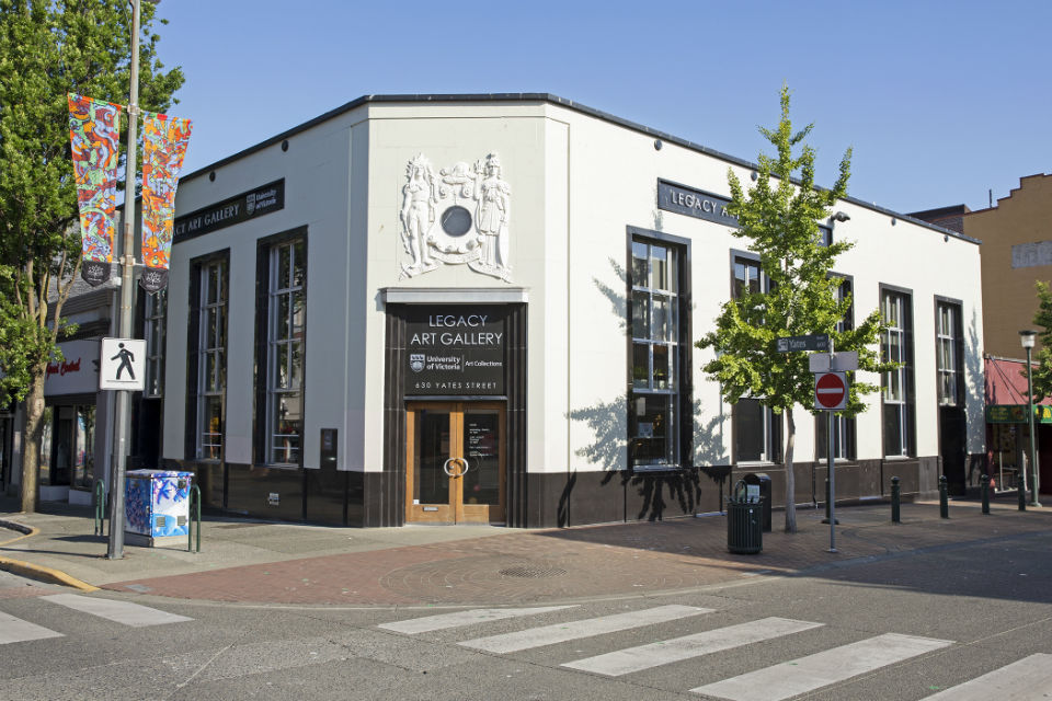
It's funny, the modern bank building on the Yates corner has a tall ground floor, it has strong vertical windows/lines, and it has distinctive/defining details. So how come you could get away with a modern building like that back in the day (~1950s) but in the 21st century you can't? I feel like the "real" design for the left section of Chard's project is peeking through at the very top there. Imagine that building stretched from the top all the way down to the ground, with the entire blah brick costume stripped away. Clad it in something that has texture and character. Let it show off some individuality. Allow it to belong in the old town.
Anyway...
Edited by aastra, 22 January 2019 - 04:36 PM.


 This topic is locked

 ) in Old Town.


_01.jpg/1920px-CaixaForum_Madrid_(Espa%C3%B1a)_01.jpg)


