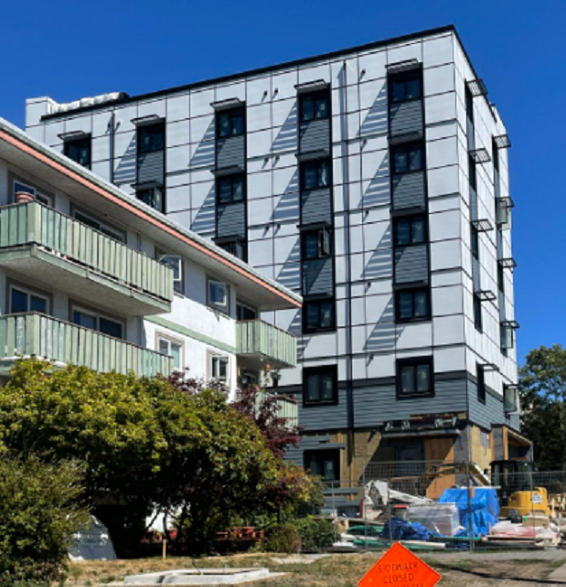
You know, from some angles this building just looks odd.
 | BUILT Hudson House Uses: rental, commercial Address: 1700 Blanshard Street Municipality: Victoria Region: Downtown Victoria Storeys: 23 |
Hudson House is a 23-storey rental tower with a commercial component along the 1700-block of Blanshard Street ... (view full profile)
Learn more about Hudson House on Citified.ca
Learn more about Hudson House on Citified.ca

[Downtown] Hudson House (Hudson Place 2) | Rentals; retail | 23-storeys | Under construction
Started by
Citified.ca
, Oct 22 2018 11:09 AM
432 replies to this topic
#322
 | Rentals; retail | 23-storeys | Under construction: post #322")
Nparker
-
- Member
- 42,889 posts
Posted 20 July 2022 - 11:29 AM
They definitely made some odd aesthetic choices.
#323
MysticalWarrior
-

- Member
- 51 posts
Posted 30 July 2022 - 02:34 PM
From today in Songhees:

- Nparker, DavidSchell and Victoria Watcher like this
#324
Nparker
-
- Member
- 42,889 posts
Posted 30 July 2022 - 02:48 PM
Far enough away that HP-2 looks pretty good.
Especially as the shadows from the balconies create some much needed visual interest on the western facade.
Edited by Nparker, 30 July 2022 - 02:49 PM.
#325
Victoria Watcher
-
- Member
- 65,620 posts
Old White Man On A Canadian Island
Posted 30 July 2022 - 02:48 PM
Lol.
#326
G-Man
-
- Moderator
-

- 13,964 posts
Senior Case Officer
Posted 07 August 2022 - 07:30 AM
Maybe the rooftop will be a restaurant. We have had a good new rooftop restaurant go in since Corazon.
- Nparker likes this
#327
aastra
-

- Member
- 21,902 posts
Posted 07 August 2022 - 09:55 PM
Pic by thegreatscaper at flickr.com. I don't mind HP2 so much from this angle. From this direction the major shortcoming might by how the clunky top spoils the refined top of HP1.
I'd say HP2 looks its worst from Store Street or otherwise straight-on from the west. From there I think the beige/black combo and the overall plainness could end up suggesting an unfinished building in perpetuity. It gives off some of the same vibe that View Towers was giving off all those decades before it was finally painted.
#328
Nparker
-
- Member
- 42,889 posts
Posted 07 August 2022 - 10:36 PM
Viewing of HP2's bland, white eastern facade is no great joy either. It also completely obscures my view of the far more attractive HP1.
#329
Nparker
-
- Member
- 42,889 posts
Posted 12 August 2022 - 02:14 PM
What does it say about the state of local residential development when even BC Housing can build something that is better looking than HP2?
- Kapten Kapsell likes this
#330
G-Man
-
- Moderator
-
- 13,964 posts
Senior Case Officer
Posted 14 August 2022 - 07:37 AM
Oh I don't agree with that at all. HP2 is vastly more attractive than this building. The windows on here may be even a smaller portion of the facade.
- DavidSchell likes this
#331
aastra
-
- Member
- 21,902 posts
Posted 14 August 2022 - 10:35 AM
With all of that black at the top were they trying to suggest the shadow of HP1? If so, I'd say that was a bad idea.
#332
Nparker
-
- Member
- 42,889 posts
Posted 14 August 2022 - 10:39 AM
Virtually every esthetic choice made on HP2 was the wrong one.
#333
BikeLaneLover
-

- Member
- 47 posts
Posted 14 August 2022 - 04:09 PM
The all-black cladding used on the top of the building was fine for the top two residential levels, but now that they've used it all the way to the top it looks really bland and ugly (in my opinion). I'm hoping that they're going to add some kind structural element to the upper portion so it's not just a wall of black. Right now it just looks off-putting and plain, especially when viewed head-on from the new Songhees park across the JSB.
Also, black is the worst possible colour to finish a building with if you're concerned about cooling and the heat island effect. It's also horrible because of all the Seagull poop it's going to show.
- aastra likes this
#334
BikeLaneLover
-
- Member
- 47 posts
Posted 14 August 2022 - 04:19 PM
Oh I don't agree with that at all. HP2 is vastly more attractive than this building. The windows on here may be even a smaller portion of the facade.
I agree with NParker on this one - the BC Housing building on Yates is basic, but the proportions of the building are appealing and the choice of panelling is much brighter and vibrant than the white/beige/black combination of HP2. I would prefer a hip roof on the Yates street building, but I actually find the windows are not as small and prison-like than they looked in the renderings (and I've walked/biked past this project multiple times).
If you want to see a truly horrific stylistic choice, however, I'd advise you take a trip up to UVic and see the new student residence buildings. The finishings are so bleak and uninviting that it looks like an institutional prison from the 1960s/70s, complete with tiny windows. Add to that the giant metal screens they've added to the main windows facing Ring Rd on the second floor and some of the windows on the upper floors of the residential levels and it looks like a apocalyptic bunker.
- Nparker likes this
#335
Mike K.
-

- Administrator
-

- 90,814 posts
Posted 15 August 2022 - 07:42 AM
Indeed, the UVic buildings are terrible. What are they thinking!?
Welcome to VV!
Welcome to VV!
Know it all.
Citified.ca is Victoria's most comprehensive research resource for new-build homes and commercial spaces.
#336
Nparker
-
- Member
- 42,889 posts
Posted 15 August 2022 - 07:47 AM
I agree with NParker on this one - the BC Housing building on Yates is basic, but the proportions of the building are appealing and the choice of panelling is much brighter and vibrant than the white/beige/black combination of HP2.

#337
aastra
-
- Member
- 21,902 posts
Posted 15 August 2022 - 08:53 AM
...it looks like an apocalyptic bunker...
Any guesses as to the day or the hour when it will be finished?
#338
Hotel Mike
-
- Member
- 2,308 posts
Hotel Mike
Posted 15 August 2022 - 09:18 AM
I really hope they do some other architectural feature at the roof or at least great lighting for night time. After a decent HP1, this is a huge disappointment.
- Mike K., aastra and Nparker like this
Don't be so sure.
#339
aastra
-
- Member
- 21,902 posts
Posted 15 August 2022 - 09:44 AM
Right now it just looks off-putting and plain
In an unflattering light the west face suggests tar paper and unfinished drywall while the actual final finishings, window frames, etc. are on backorder.
I'll file this one as the predictable conclusion to an unfortunate trend that's been worsening for several years. Although I'm not sure anyone was expecting it on the Hudson property, after such a lengthy and heavily-scrutinized saga to finally get things to where they are today. CoV's design review processes, where are you?*
*Scooby-Doo reference
In April 2017, Rob Randall said:
...I'm not sure I'm totally on board with the new square panel cladding look.
In April 2017, aastra replied:
Methinks such panels can backfire when they have a dull finish or when the colour suggests sheets of carboard or some other ordinary/unfinished material. I like them when they're slick & glossy and showing off an unexpected colour... I'm not crazy about the panels on the Union.
In June 2020 aastra said:
Those grey panels just don't have any personality. We've talked about the potential menace of drab panels before re: the panels on the Union in Chinatown (they almost look like unfinished drywall).
The particulars are different, but once again we've gone full circle on a development/design issue even though a hopeful observer would have assumed the mistake could never be repeated:
Daily Colonist
March 2, 1972
Tower Shrink Not Likely
Developer George Mulek has been asked by the city of Victoria to voluntarily reduce the size of the apartment-store centre, to be completed at View and Quadra, but there apparently isn't much likelihood that he will.
Mayor Peter Pollen said Wednesday that Mulek was "unbending" in his attitude, and seemed determined to stick by his original plan to build a second tower slightly taller than the 19-storey apartment building already at the site.
The grey, unfinished look of the first building, completed last year, has brought considerable criticism from the city.
#340
aastra
-
- Member
- 21,902 posts
Posted 15 August 2022 - 09:51 AM
Curious minds want to know: what would it look like if the Blanshard face of the tower were copied over to the west face?
You're not quite at the end of this discussion topic!
Use the page links at the lower-left to go to the next page to read additional posts.
Use the page links at the lower-left to go to the next page to read additional posts.


1 user(s) are reading this topic
0 members, 1 guests, 0 anonymous users

