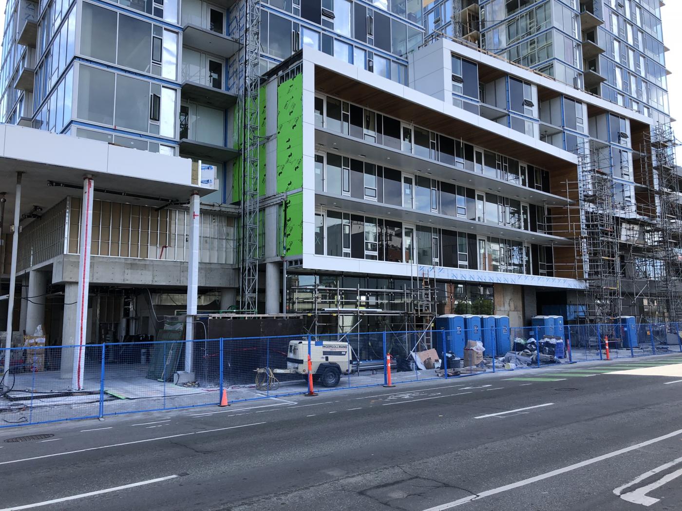
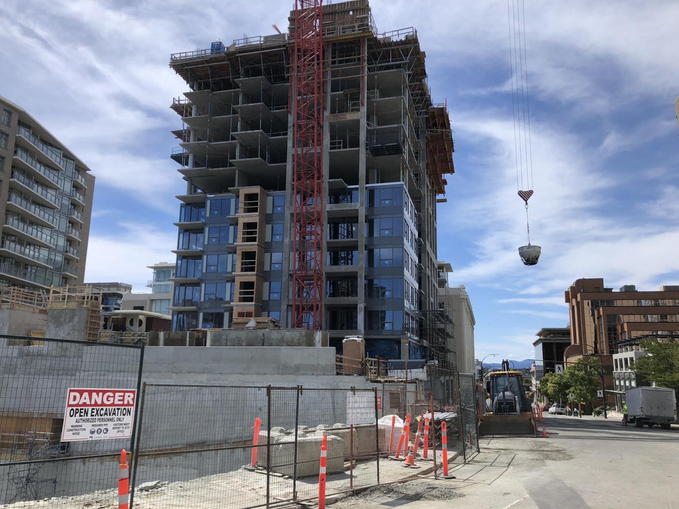
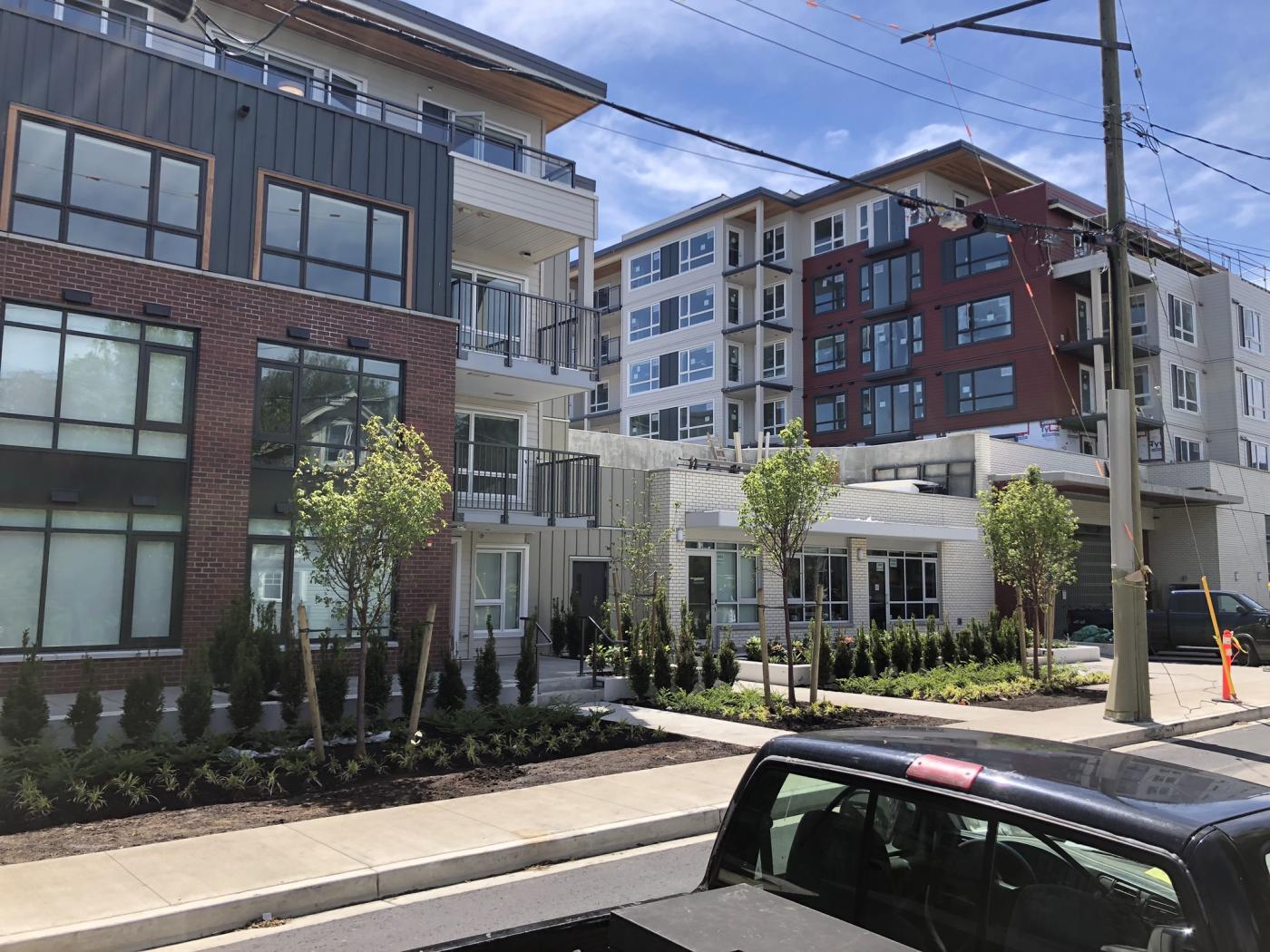
Okay, all of you brick fetishists out there. Columbus, OH seems to have Victoria soundly beat re: being self-conscious about using brick in new construction. And their best examples are really good, I think. Check out some that I thought were interesting:
This one is quite plain but I really like that arch and I'd say the windows are exactly right (especially the differentiation of the ground level from levels above, with tall and narrow along the ground). There's also some very subtle ornamentation in the brickwork that really sells it.
This one exemplifies that modern-but-stately esthetic that I like, and -- unlike many other new buildings in the immediate area -- it doesn't look faux. Again, great windows. And check out the treatment of the entrance on the long side.
This one gets the narrow windows right along the podium, and even though the esthetic of the upper levels is all about the 21st-century, it all comes together because the narrow windows continue right to the top (the illusion of double-height windows emphasizes the narrowed effect)
If this building were in Victoria those metal window dividers (or whatever they're made of) would probably be covered in brick as well (or maybe painted concrete).
Some people might complain that this one looks faux on the podium level, but I'd file it as a success. It looks neither cheap nor hokey. Also, not only is the tower portion a complete stylistic departure from the ground level, but it's also covered in black brick even though red brick dominates the neighbourhood. Are you allowed to do that?? Looks great.
Things don't have to be repetitive and monotonous or an overload of one basic flavour...
This one is like an enlarged/extended version of the building that previously occupied the site. When Victorians are yearning to do yet another demolition, would they ever dare honour the lost building in the new one? (Oak Bay Avenue project, I'm looking at you. It would have been a great opportunity.)
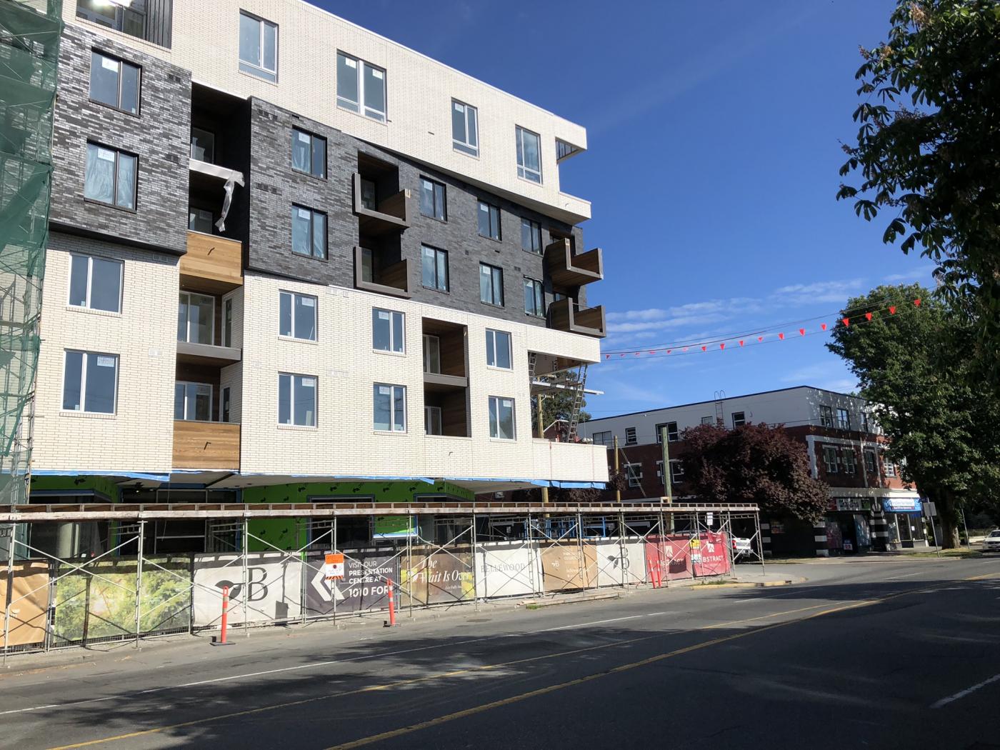
Purpose-built granularity is impossible... or is it? Three different styles, three different colours/types of brick, three different window treatments.
Too faux? I suppose it is on the upper levels, but damn, that ground floor is fantastic. Imagine building some new ground floors like that in Victoria. Heck, imagine repairing some of the botched old ground floors in that manner (700-block Yates, I'm looking at you)
This one has some of that blocky/heavy faux-ness that you often see in new buildings that try hard to "fit in", but I really like those dark upper levels and the balcony railings. Give me some of this good stuff in Victoria's old town and in the neighbourhoods, too. (Just ignore the lame sections on either side of the dark middle section.)
Edit: Great neighbourhood corner building...
Edited by aastra, 20 November 2019 - 11:14 AM.