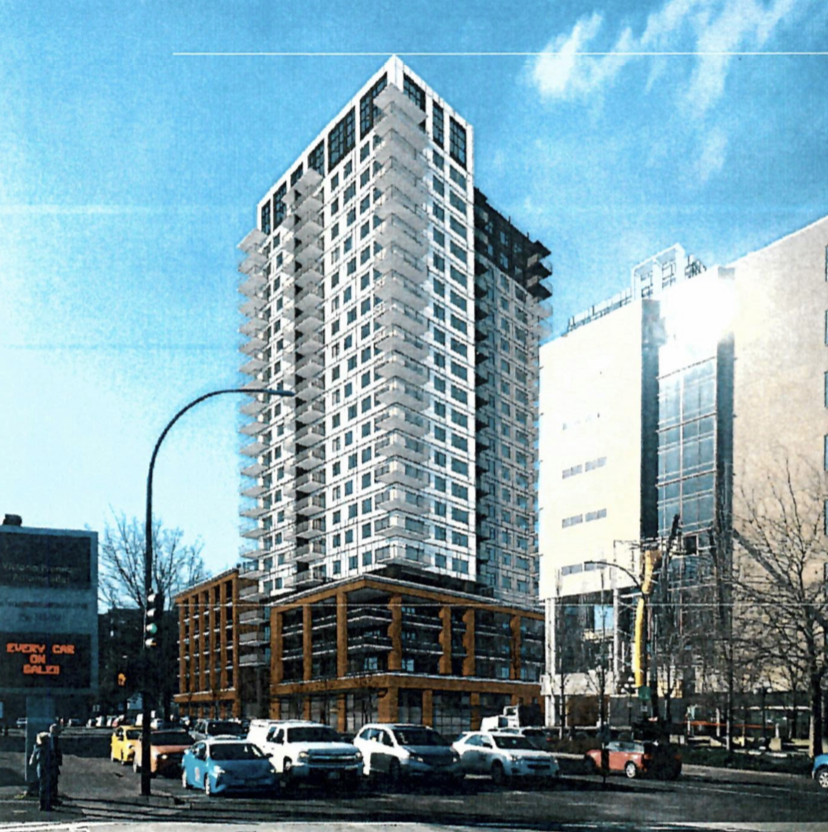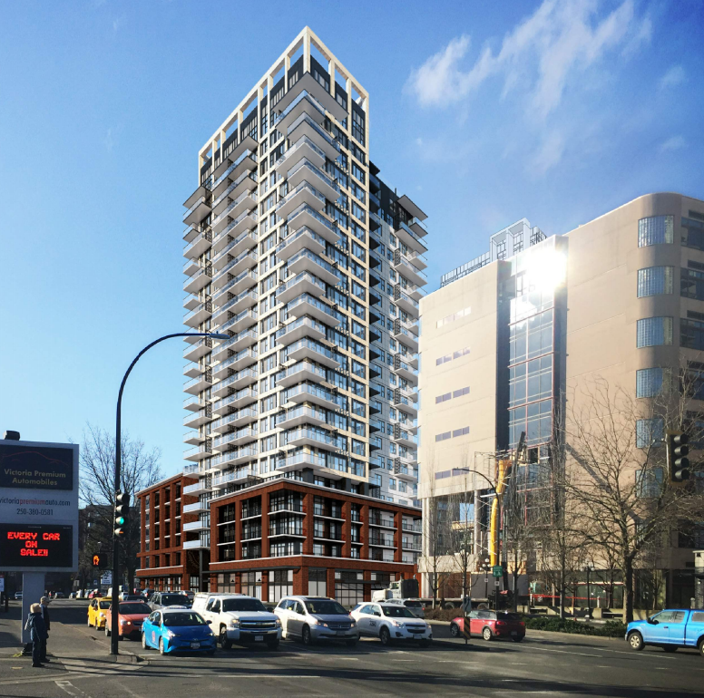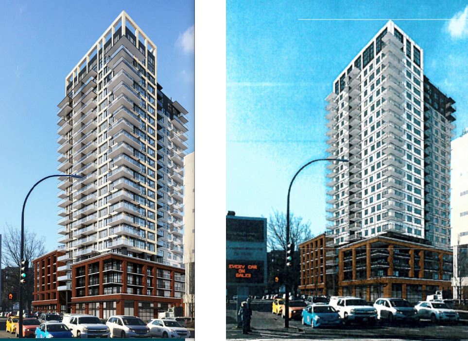

The April 10 version was pretty good but this version has really gone backwards. They've dialed down the personality and dialed up the bland. The monotony of those plain windows just looks lame. The tower had strong lines before, if you get my meaning. Those lines are gone now. It's just flat and blah.
Seriously, I would take no joy in seeing that building go up.
It's times like these I am very curious about what the staff comments letter included. Here are some excerpts from the "summary of changes" provided by the architect in response to the comments:
- Reduced balcony sizes. Removed alternating balcony pattern and privacy screens from corner balconies.
- Change brick cladding to window wall with spandrel panel.
- Deleted open frame work at roof level.
- Window wall panels revised to raised panel on both tower elements, eastern element changed to white and western element to neutral grey.
- Deleted stair windows.