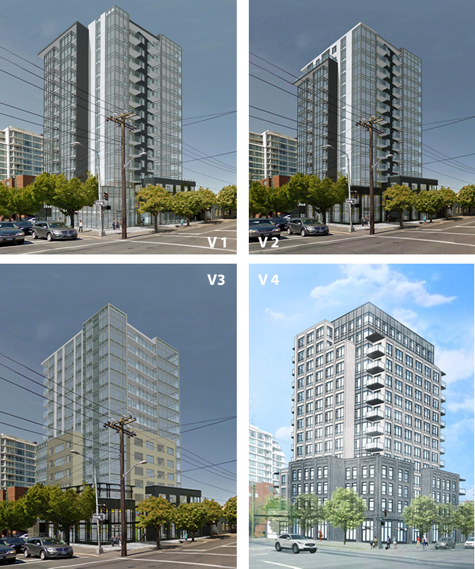
I really like the podium
 | BUILT 1400 Quadra Street Uses: rental, commercial Address: 1400-1412 Quadra Street Municipality: Victoria Region: Downtown Victoria Storeys: 14 |
1400-1412 Quadra Street is a 14-storey purpose-built rental complex on Quadra Street at Johnson Street in down... (view full profile)
Learn more about 1400 Quadra Street on Citified.ca
Learn more about 1400 Quadra Street on Citified.ca

[Downtown Victoria] 1400 Quadra Street | Rentals, retail | 14-storeys | Under construction
Started by
VicHockeyFan
, Jul 02 2016 01:22 PM
584 replies to this topic
#122

Mike K.
-

- Administrator
-

- 83,560 posts
Posted 18 April 2018 - 12:50 PM
I actually quite like this design!
The unit count has fallen from 118-units to 113 (plus a unit described as a "business core suite), and unit sizes have fallen from a maximum of over 1,000 square feet to just under 900 square feet. The project now includes studio apartments and junior 1BD's, plus 11 live-work units on the second floor.
Know it all.
Citified.ca is Victoria's most comprehensive research resource for new-build homes and commercial spaces.
#123
Jackerbie
-

- Member
- 3,776 posts
- LocationRichmond, BC
Posted 18 April 2018 - 12:57 PM
I agree that the podium especially is attractive. As for everything above the podium, the design is neither amazing nor terrible, but I don't like the building massing. The architect didn't really have much of a choice though, I think. This is one of the countless examples in Victoria where the allowable FSR and maximum height just don't work well together.
- Nparker likes this
#124
jonny
-

- Member
- 9,211 posts
Posted 18 April 2018 - 01:00 PM
*Citizens of Vibrant Victoria shriek in terror as the anti-height laser beam strikes again and chops off the top 1/3 of yet another building in downtown Victoria, BC.*
#125
RFS
-

- Member
- 5,444 posts
Posted 18 April 2018 - 01:02 PM
I agree that the podium especially is attractive. As for everything above the podium, the design is neither amazing nor terrible, but I don't like the building massing. The architect didn't really have much of a choice though, I think. This is one of the countless examples in Victoria where the allowable FSR and maximum height just don't work well together.
It is rentals after all
#126
jonny
-
- Member
- 9,211 posts
Posted 18 April 2018 - 01:05 PM
Other than I think it'll end up looking too squat like the 834, I quite like this. I love the bottom and quite like the top. Whether this ends up being just OK or great will come down to textures and finishing materials. I quite like the charcoal spandrel, which adds a bit of depth and dimension to the design.
#127
Nparker
-
- Member
- 40,775 posts
Posted 18 April 2018 - 01:13 PM
I don't dislike it, but man-on-man* innovative design sure is discouraged in this city.
* edited to adhere to VV community standards 
Edited by Nparker, 18 April 2018 - 01:19 PM.
#128
Mike K.
-
- Administrator
-
- 83,560 posts
Posted 18 April 2018 - 01:17 PM
Man on man, hey?
- Matt R. likes this
Know it all.
Citified.ca is Victoria's most comprehensive research resource for new-build homes and commercial spaces.
#130
Jackerbie
-
- Member
- 3,776 posts
- LocationRichmond, BC
Posted 18 April 2018 - 01:19 PM
Traditional man on man design

- Nparker likes this
#131
Nparker
-
- Member
- 40,775 posts
Posted 18 April 2018 - 01:22 PM
Traditional man on man design...
To be fair, it's hard to tell if the figures on the top are men. This is starting to veer off-topic so I am going to stamp this one myself

- Mike K. likes this
#132
aastra
-

- Member
- 20,763 posts
Posted 18 April 2018 - 02:37 PM
Really don't like it. Chard's building is going to be dark and heavy on the Johnson side, this building is going to be dark and heavy on the Johnson side... are we trying to create a really scary and gloomy block there between Blanshard and Quadra or something?
....the building is now a fairly nondescript box...
Absolutely. Blocky, nondescript, almost like a residential version of the CIBC tower or something. Like a hotel tower from 1975. So much repeating drabness on the tower levels.
The stained glass inspired touches are gone.
All of the flavour and uniqueness is gone. From distinctive to drab. This project is like a case study in how to take a design in the wrong direction. It's baffling, honestly. How does this sort of thing happen?
edit looking back in 2019: some better images came later, and after seeing them I didn't mind the redesign nearly as much as I did when I posted the above. The brick-veneer on the tower portion seems like it could work, and I also like the windows on the tower and how they're different from the windows on the podium. But I still worry about the heaviness and potentially "faux" nature of the podium. and I still can't fathom the process by which the design changed so completely from the original concept.
Edited by aastra, 26 September 2019 - 02:11 PM.
#134
Nparker
-
- Member
- 40,775 posts
Posted 18 April 2018 - 02:47 PM
...All of the flavour and uniqueness is gone.
Yup.
#135
Jackerbie
-
- Member
- 3,776 posts
- LocationRichmond, BC
Posted 18 April 2018 - 02:51 PM
Fun game: take the four proposals, and ask someone without any knowledge of the application to put them in order from first submission to the final design. This game is even more fun with Northern Junk!
- Mike K., Nparker and sdwright.vic like this
#136
aastra
-
- Member
- 20,763 posts
Posted 18 April 2018 - 03:04 PM
That's a good point. Most people would look for some sort of progression re: sharpening and refinement, and thus arrange them in reverse order. The newest version actually looks like an altogether different project (awaiting its own process of refinement).
As always I await a better rendering in full colour that might change my impression, but the quality of these images seems to be sufficient to get the gist of it.
It becomes all the more frustrating when you check out other residential buildings by the same architects.
#137
RFS
-
- Member
- 5,444 posts
Posted 18 April 2018 - 03:59 PM
I find the latest rendering the most handsome and least generic of the bunch. Its darker materials for sure but it works and looks dramatic and urban. Could be taller but it looks great. Should be condos
- zoomer likes this
#138
sdwright.vic
-

- Member
- 6,685 posts
Colwood
Posted 18 April 2018 - 04:08 PM
^yeah because people who rent should have no place(s) to Live?
Predictive text and a tiny keyboard are not my friends!
#139
Kapten Kapsell
-

- Member
- 3,539 posts
Posted 18 April 2018 - 04:38 PM
Nothing in the standard disclosure agreement from a condo developer would prevent buyers from renting out their condos...
#140
sdwright.vic
-
- Member
- 6,685 posts
Colwood
Posted 18 April 2018 - 04:49 PM
Except for the fact that I would never rent from a private condo owner.
Predictive text and a tiny keyboard are not my friends!
You're not quite at the end of this discussion topic!
Use the page links at the lower-left to go to the next page to read additional posts.
Use the page links at the lower-left to go to the next page to read additional posts.


1 user(s) are reading this topic
0 members, 1 guests, 0 anonymous users

